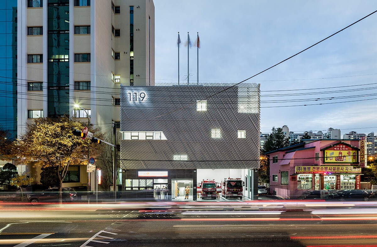
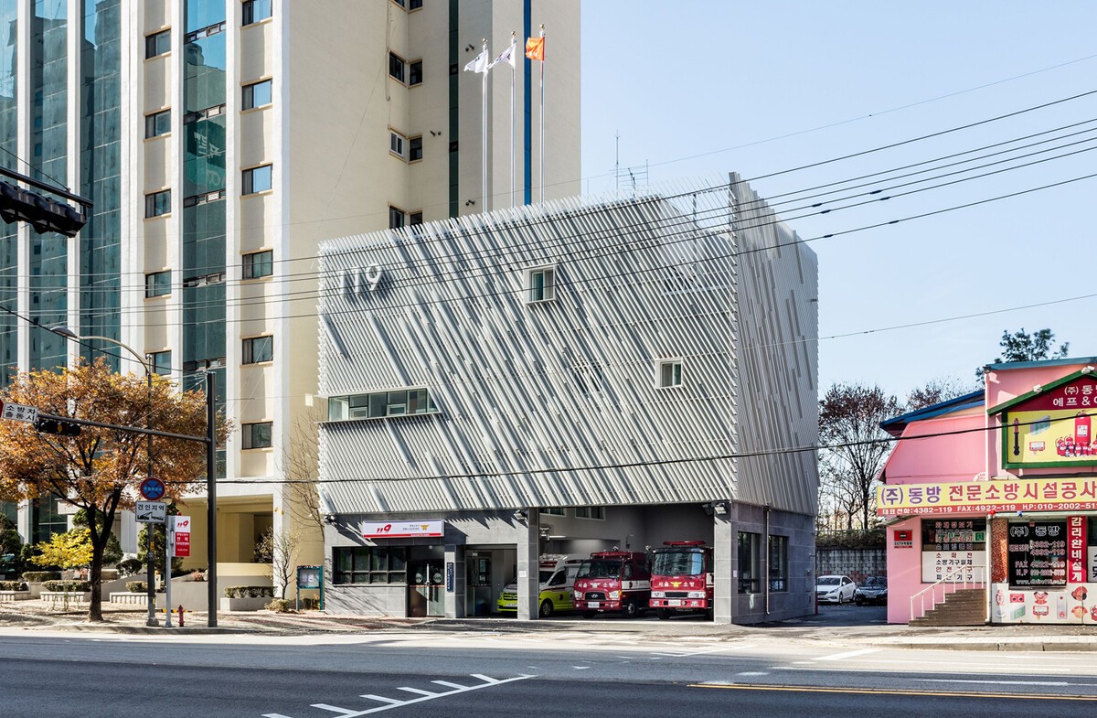
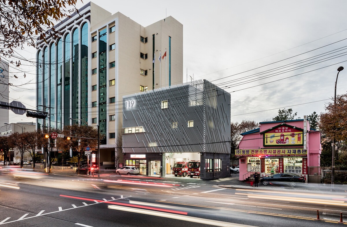
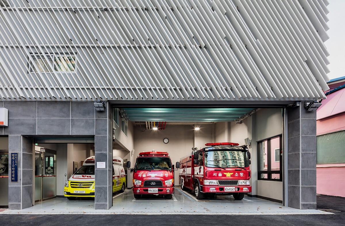
Myeonmok Fire Station.
By Yong Ju Lee Architecture.
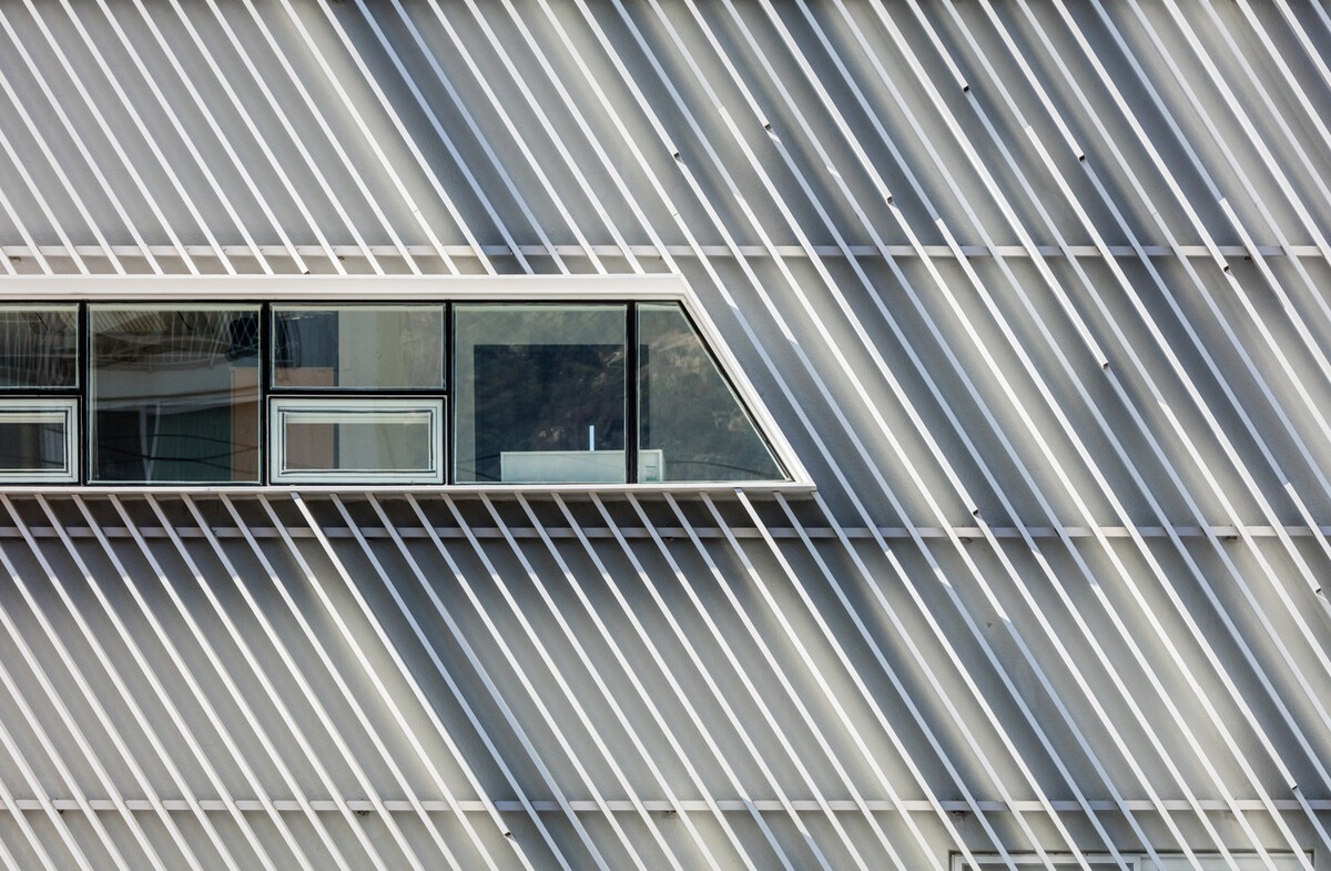
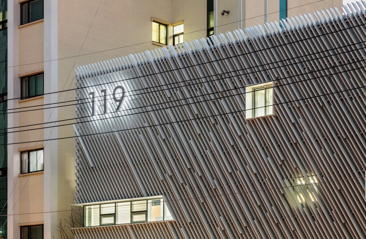
ArchitectureOne of our favourite buildings of the famous Korean studio Yong Ju Lee Architecture. The elegant louvers in elevation symbolize quick mobilization of fire trucks. The gradient pattern generated combined by two louver types with different depth (100mm and 200mm) is employed to maximize this concept.
And what we like the most: while many fire stations stand out the most visually in urban context to symbolize their identity by red color and bold signage, this new station tries to deal with it by the building itself.
What's your opinion, dude.
